
React Input Component with Tailwind CSS [Icon + Label + Error]
Whenever we want the user to insert some value in the application, we need a form element, and the input is the most essential part of the form. In this piece of content, you will find Tailwind CSS code for an input component with all the necessary props, including icon, label and error.
Input Component Use Cases
- Login & Signup Forms – Collect user emails, passwords, etc.
- Search Bars – Add an icon for a better UI experience.
- User Profile Forms – Input fields for updating user information.
- E-commerce Checkout – Collect user details like name, email, and phone number.
We are tackling 7 props in this input component using TypeScript.
1interface InputProps { 2 type: 'text' | 'number' | 'email' | 'password' 3 label?: string 4 value: string | number 5 name: string 6 placeholder: string 7 error?: string 8 disabled?: boolean 9 onChange: (e: ChangeEvent<HTMLInputElement>) => void 10}
We are also displaying the optional label and error.
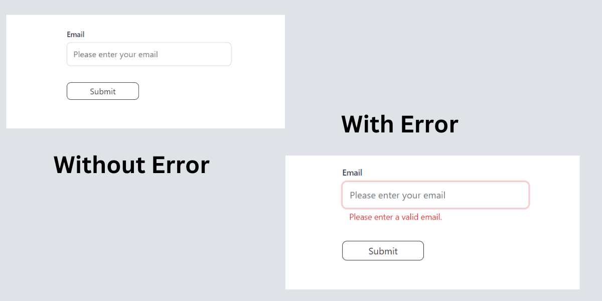
Tailwind CSS Input with Error
This is how the component looks with and without error:
Tailwind CSS Input Component Code
How to use in parent Component
To test the component, we need to wrap input component inside a form element, which will have a submit button too.
The input has a full width. We will adjust its width by putting it inside a wrapper. Below, I provide a form element with max-w-80, which is equivalent to 320px.
1import { ChangeEvent, FormEvent, useState } from 'react' 2import Input from './components/input' 3 4function App() { 5 const [email, setEmail] = useState<string>('') 6 const [error, setError] = useState<string>('') 7 8 const handleChange = (e: ChangeEvent<HTMLInputElement>): void => { 9 setEmail(e.target.value) 10 } 11 12 const handleSubmit = (event: FormEvent<HTMLFormElement>): void => { 13 event.preventDefault() 14 if (!email) { 15 setError('Please enter a valid email.') 16 } else { 17 console.log('email', email) 18 setError('') 19 // Handle form submission 20 } 21 } 22 23 return ( 24 <> 25 <div className="max-w-6xl mx-auto px-3"> 26 <form onSubmit={handleSubmit} className="max-w-80 mt-10"> 27 <Input 28 type="email" 29 label="Email" 30 name="email" 31 placeholder="Please enter your email" 32 value={email} 33 onChange={handleChange} 34 error={error} 35 /> 36 <button 37 type="submit" 38 className="text-neutral-800 rounded-lg border border-neutral-800 bg-transparent px-2 py-1 min-w-[140px] mt-4 hover:bg-gray-200 hover:border-gray-400 " 39 > 40 Submit 41 </button> 42 </form> 43 </div> 44 </> 45 ) 46} 47 48export default App
If you want to learn how to build this component step by step, read the React reusable input component tutorial.
React Input Component with Icon
Key Features
✅ Customizable Input Type – Supports text, email, number, and password.
✅ Built-in Label & Placeholder – Allows setting a label and placeholder text.
✅ Error Handling – Displays an error message when input is invalid.
✅ Icon Support – Includes an optional icon inside the input field.
✅ Disabled State – Can disable input when needed.
Please enter a valid email.
React Input Component API
| Prop | Type | Required | Default | Description |
|---|---|---|---|---|
| type | 'text' | 'number' | 'email' | 'password' | Yes | 'email' | Defines the type of input field. |
| label | string | No | 'Email' | Displays a label above the input field. |
| value | string | number | Yes | '' | Holds the current value of the input field. |
| name | string | Yes | 'email' | Specifies the name attribute of the input field. |
| placeholder | string | No | 'Please enter your email' | Text displayed inside the input as a placeholder. |
| error | string | No | 'Please enter a valid email.' | Displays an error message if input validation fails. |
| disabled | boolean | No | false | Disables the input field when set to true. |
| onChange | (e: ChangeEvent<HTMLInputElement>) => void | Yes | undefined | Function triggered when input value changes. |
| icon | React.ReactNode | No | <Mail size={20} /> | Icon displayed inside the input field. |
How to use in parent Component
1import { Mail } from 'lucide-react' 2import { ChangeEvent, FormEvent, useState } from 'react' 3import InputField from './components/input/input-icon' 4 5function App() { 6 const [email, setEmail] = useState<string>('') 7 const [error, setError] = useState<string>('') 8 9 const handleChange = (e: ChangeEvent<HTMLInputElement>): void => { 10 setEmail(e.target.value) 11 } 12 13 const handleSubmit = (event: FormEvent<HTMLFormElement>): void => { 14 event.preventDefault() 15 if (!email) { 16 setError('Please enter a valid email.') 17 } else { 18 console.log('email', email) 19 setError('') 20 // Handle form submission 21 } 22 } 23 24 return ( 25 <> 26 <div className="mx-auto max-w-6xl px-3"> 27 <form onSubmit={handleSubmit} className="mt-10 max-w-80"> 28 <InputField 29 type="email" 30 label="Email" 31 name="email" 32 placeholder="Please enter your email" 33 value={email} 34 onChange={handleChange} 35 error={error} 36 icon={<Mail size={20} />} 37 /> 38 <button 39 type="submit" 40 className="mt-4 min-w-[140px] rounded-lg border border-neutral-800 bg-transparent px-2 py-1 text-neutral-800 hover:border-gray-400 hover:bg-gray-200 "> 41 Submit 42 </button> 43 </form> 44 </div> 45 </> 46 ) 47} 48 49export default App
Don't forget to let me know if it helps you.