Create a Dynamic Quiz Card Component with React, TypeScript, and Tailwind CSS

In modern web applications, creating interactive and user-friendly components is essential. One such component is the quiz card.

In this article, I'll walk you through building a dynamic quiz card component using React, TypeScript, and Tailwind CSS. This code will cover the main features, including a responsive design, interactive elements, and a countdown timer.

Key Features of the Quiz Card

Our quiz card component includes 5 important features:

  1. The "Next" button is disabled until an answer is selected.
  2. Displaying the current question number and the total number of questions.
  3. A countdown timer to enhance the quiz experience.
  4. Selected answers are highlighted for better user interaction.
  5. Wrote a util funciton addLeadingZero to add a leading zero if number is less than 10

This quiz card is built with Typescript and Tailwind CSS, using the best React practices.

Important Points

Here are 4 key implementation details to make our quiz card component modular and efficient:

  1. Reusable Quiz Option Component: Extracted the quiz option logic into a reusable component for better maintainability.
  2. Separation of Data: Used a separate file to manage quiz questions data.
  3. Icon Library: Integrated a third-party icon library for the timer icon to save development time. You can use icon of your choice.
  4. Consistent Theming: Applied consistent background and text colors in body to maintain a theme.
index.css
1body { 2 @apply bg-[#0f172a] text-white; 3 font-family: 'Anek Malayalam', sans-serif; 4}
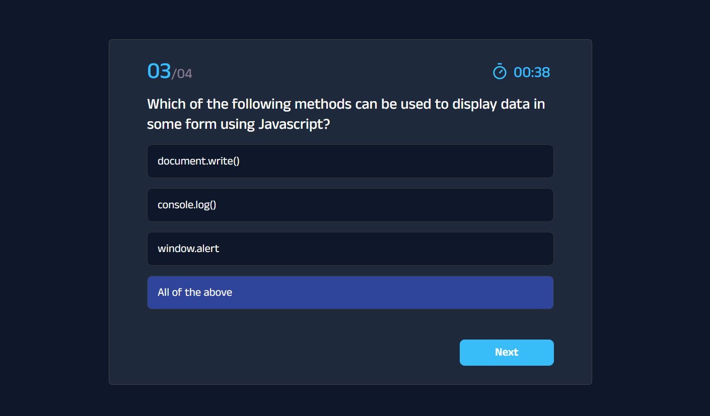
Quiz Card UI

This is how Quiz Card component UI looks like: Tailwind Quiz component UI

Tailwind Quiz Card Component Code

quiz-card.tsx
1import { Timer } from 'lucide-react' 2import { useEffect, useState } from 'react' 3import { quiz } from '../appData/QuizQuestions' 4import QuizOption from './QuizOption' 5 6const Quiz = () => { 7 const [activeQuestion, setActiveQuestion] = useState<number>(0) 8 const [selectedAnswerIndex, setSelectedAnswerIndex] = useState<number | null>( 9 null, 10 ) 11 const [timer, setTimer] = useState(60) 12 13 const { questions } = quiz 14 const { question, choices } = questions[activeQuestion] 15 16 const onClickNext = () => { 17 setSelectedAnswerIndex(null) 18 19 if (activeQuestion !== questions.length - 1) { 20 setActiveQuestion((prev) => prev + 1) 21 } else { 22 setActiveQuestion(0) 23 } 24 } 25 26 const onAnswerSelected = (answer: string, index: number) => { 27 setSelectedAnswerIndex(index) 28 } 29 30 useEffect(() => { 31 if (timer > 0) { 32 const countdown = setInterval(() => setTimer(timer - 1), 1000) 33 return () => clearInterval(countdown) 34 } 35 }, [timer]) 36 37 const addLeadingZero = (number: number) => 38 number > 9 ? number : `0${number}` 39 40 return ( 41 <div className="mx-auto mt-[100px] max-w-3xl rounded-md border border-[#444444] bg-[#1e293b] px-[60px] py-[30px]"> 42 <div className="flex items-center justify-between"> 43 <div> 44 <span className="text-4xl font-medium text-[#38bdf8]"> 45 {addLeadingZero(activeQuestion + 1)} 46 </span> 47 <span className="text-[22px] font-medium text-[#817a8e]"> 48 /{addLeadingZero(questions.length)} 49 </span> 50 </div> 51 <div className="flex w-[100px] items-center gap-2"> 52 <Timer color="#38bdf8" width={28} height={28} /> 53 <span className="mt-1 block text-2xl font-medium text-[#38bdf8]"> 54 00:{addLeadingZero(timer)} 55 </span> 56 </div> 57 </div> 58 <h3 className="my-4 text-2xl font-medium">{question}</h3> 59 <form> 60 {choices.map((answer, index) => ( 61 <QuizOption 62 key={answer} 63 index={index} 64 answer={answer} 65 selectedAnswerIndex={selectedAnswerIndex} 66 onAnswerSelected={onAnswerSelected} 67 /> 68 ))} 69 </form> 70 <div className="flex justify-end"> 71 <button 72 onClick={onClickNext} 73 disabled={selectedAnswerIndex === null} 74 className="mt-12 min-w-[150px] transform cursor-pointer rounded-lg border border-[#38bdf8] bg-[#38bdf8] px-5 py-1.5 text-lg font-semibold text-white outline-none transition duration-300 ease-in-out hover:scale-105 hover:bg-[#1d4ed8] active:scale-95 active:bg-[#1e40af] disabled:cursor-not-allowed disabled:border-gray-500 disabled:bg-gray-800 disabled:text-gray-500 disabled:hover:scale-100" 75 > 76 {activeQuestion === questions.length - 1 ? 'Finish' : 'Next'} 77 </button> 78 </div> 79 </div> 80 ) 81} 82 83export default Quiz

Quiz Option Component Code

Here’s the code for the QuizOption component, which handles individual quiz choices.

quiz-option.tsx
1interface QuizOptionProps { 2 index: number 3 answer: string 4 selectedAnswerIndex: number | null 5 onAnswerSelected: (answer: string, index: number) => void 6} 7 8const QuizOption: React.FC<QuizOptionProps> = ({ 9 index, 10 answer, 11 selectedAnswerIndex, 12 onAnswerSelected, 13}) => { 14 return ( 15 <div className="relative mt-4 cursor-pointer"> 16 <input 17 type="radio" 18 id={`choice-${index}`} 19 name="quiz" 20 value={answer} 21 checked={selectedAnswerIndex === index} 22 onChange={() => onAnswerSelected(answer, index)} 23 className="hidden" 24 /> 25 <label 26 htmlFor={`choice-${index}`} 27 className={`block cursor-pointer rounded-lg border border-[#333] bg-[#0f172a] px-4 py-3 text-lg text-white transition-colors duration-300 ease-in-out ${ 28 selectedAnswerIndex === index ? 'border-[#2f459c] bg-[#2f459c]' : '' 29 }`} 30 > 31 {answer} 32 </label> 33 </div> 34 ) 35} 36 37export default QuizOption

Quiz Timer Logic

The quiz component includes a countdown timer to keep track of time.

Here’s how to set it up:

  1. Declare state for timer and set initails value to 60 (seconds)
  2. In the useEffect hook, we wrote the logic for counting down the time.
hooks/useTimer.ts
1const [timer, setTimer] = useState(60) 2 3useEffect(() => { 4 if (timer > 0) { 5 const countdown = setInterval(() => setTimer(timer - 1), 1000) 6 return () => clearInterval(countdown) 7 } 8}, [timer])

Quiz Question Data Structure

Here’s the structure of the quiz data used in our application.

data.ts
1interface Question { 2 question: string 3 choices: string[] 4 type: string 5 correctAnswer: string 6} 7 8interface QuizData { 9 topic: string 10 level: string 11 totalQuestions: number 12 perQuestionScore: number 13 totalTime: number // in seconds 14 questions: Question[] 15} 16 17export const quiz: QuizData = { 18 topic: 'Javascript', 19 level: 'Beginner', 20 totalQuestions: 4, 21 perQuestionScore: 5, 22 totalTime: 60, 23 questions: [ 24 { 25 question: 26 'Which function is used to serialize an object into a JSON string in Javascript?', 27 choices: ['stringify()', 'parse()', 'convert()', 'None of the above'], 28 type: 'MCQs', 29 correctAnswer: 'stringify()', 30 }, 31 { 32 question: 33 'Which of the following keywords is used to define a variable in Javascript?', 34 choices: ['var', 'let', 'var and let', 'None of the above'], 35 type: 'MCQs', 36 correctAnswer: 'var and let', 37 }, 38 { 39 question: 40 'Which of the following methods can be used to display data in some form using Javascript?', 41 choices: [ 42 'document.write()', 43 'console.log()', 44 'window.alert', 45 'All of the above', 46 ], 47 type: 'MCQs', 48 correctAnswer: 'All of the above', 49 }, 50 { 51 question: 'How can a datatype be declared to be a constant type?', 52 choices: ['const', 'var', 'let', 'constant'], 53 type: 'MCQs', 54 correctAnswer: 'const', 55 }, 56 ], 57}

Feel free to use this Quiz Card component in your projects.


Flexy UI Newsletter

Build better and faster UIs.Get the latest Tailwind UI components directly in your inbox. No spam!


Flexy UI Newsletter

Build better and faster UIs.Get the latest Tailwind UI components directly in your inbox. No spam!