

React Tailwind CSS Button Design System: 3 Variants & Loading Spinner
Buttons are fundamental UI elements in web development, serving as key interaction points for users. Designing a flexible, reusable button component can significantly enhance the consistency and scalability of your React application.
In this guide, we’ll walk you through creating a button component using React and Tailwind CSS with three distinct variants Primary, Secondary, and Outline as well as a disabled state and a loading spinner for better user feedback..
Whether you're building a small project or a large-scale application, having a well-designed button component is crucial. This button design system ensures that your buttons are not only visually appealing but also accessible and easy to maintain.
Button Component UI
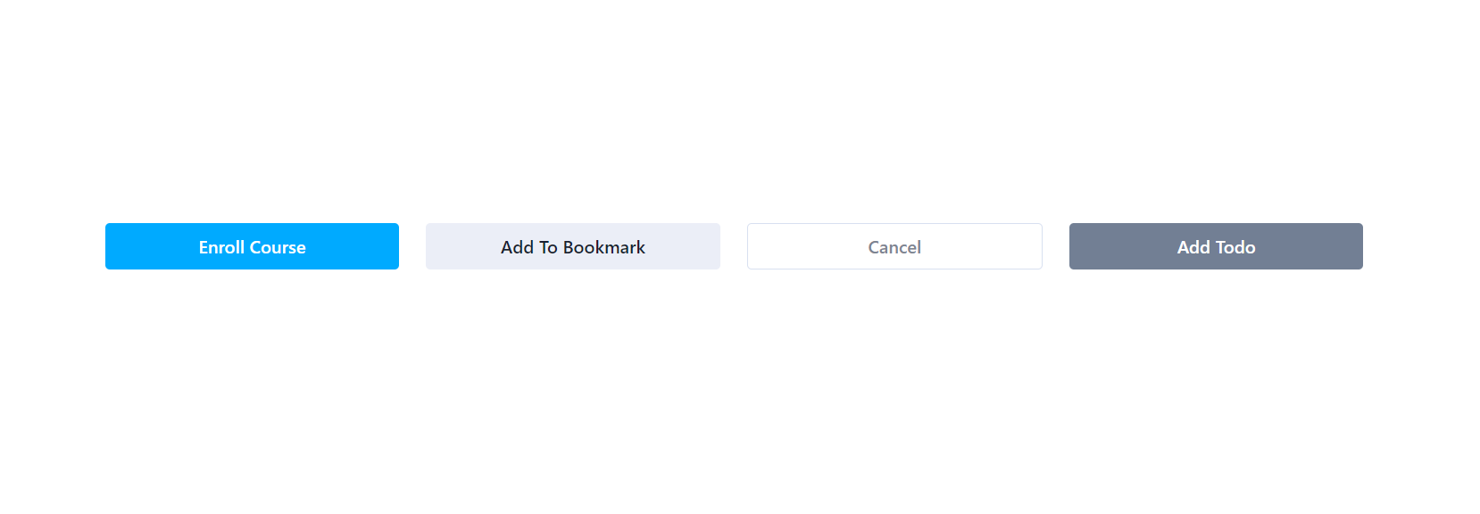
Button Component Variants
- Primary - Attention grabbing color
- Secondary - For secondary action
- Outline - A minimalist style with a transparent background and border.
Tailwind CSS Button Component Code
The button component is built with TypeScript and accepts the following props:
- children: The content or text inside the button.
- variant: Determines the button style; can be primary, secondary, or outline. Defaults to primary.
- disabled: A boolean indicating whether the button is disabled. Defaults to false.
- onClick: A function to handle the button's click event.
Here’s the complete code for the button component:
1import React, { ReactNode, MouseEventHandler } from 'react' 2import classNames from 'classnames' 3 4interface ButtonProps { 5 children: ReactNode 6 variant?: 'primary' | 'secondary' | 'outline' 7 disabled?: boolean 8 onClick?: MouseEventHandler<HTMLButtonElement> 9} 10 11const Button: React.FC<ButtonProps> = ({ 12 children, 13 variant = 'primary', 14 disabled = false, 15 onClick, 16}) => { 17 const baseStyles = 18 'w-full max-w-xs rounded py-2 font-medium transition duration-300 ease-in-out' 19 20 const variantStyles = { 21 primary: 'bg-[#00AAFF] text-white hover:bg-sky-600', 22 secondary: 'bg-[#EBEEF7] text-[#191F33] hover:bg-violet-200', 23 outline: 24 'bg-transparent text-[#7D8592] border border-[#D8E0F0] hover:bg-[#D8E0F0]', 25 } 26 27 const disabledStyles = 'bg-[#727f94] text-white cursor-not-allowed' 28 29 return ( 30 <button 31 className={classNames( 32 baseStyles, 33 disabled ? disabledStyles : variantStyles[variant!], 34 )} 35 disabled={disabled} 36 onClick={onClick} 37 > 38 {children} 39 </button> 40 ) 41} 42 43export default Button
Component Usage Example
To use the button component in your application, simply import it and specify the desired props. Below is an example of how to use the button component with different variants:
1import Button from './components/Button' 2 3function App() { 4 return ( 5 <div className="mx-auto max-w-6xl px-3"> 6 <div className="my-10 flex gap-6"> 7 <Button>Enroll Course</Button> 8 <Button variant="secondary">Add To Bookmark</Button> 9 <Button variant="outline">Cancel</Button> 10 <Button variant="outline" disabled> 11 Add Todo 12 </Button> 13 </div> 14 </div> 15 ) 16}
React Tailwind Loading Spinner Button
The React Tailwind Loading Spinner Button is a handy interactive button that makes your app feel more polished. When the button is clicked to perform tasks like API calls or form submissions, it shows a spinning loader instead of plain text, letting users know something is happening.
Features of the Loading Spinner Button
- Dynamic Spinner Animation: Displays a spinning loader icon when in the loading state.
- Disabled State Handling: Automatically disables the button during loading to prevent duplicate submissions.
- Customizable Text: Supports dynamic button text

Props Accepted by the Loading Spinner Button
| Prop | Type | Required | Default | Description |
|---|---|---|---|---|
| onSubmit | function | Yes | undefined | Function to execute when the button is clicked. |
| text | string | Yes | undefined | Text to display on the button when not loading. |
| loading | boolean | No | false | If true, shows the loading spinner instead of the text. |
| disabled | boolean | No | false | If true, disables the button to prevent user interaction. |
React Tailwind Loading Spinner Button Component Code
1import { LoaderCircle } from 'lucide-react' 2import React from 'react' 3 4type ButtonProps = { 5 onSubmit: () => void 6 text: string 7 loading?: boolean 8 disabled?: boolean 9} 10 11const Button: React.FC<ButtonProps> = ({ 12 onSubmit, 13 text, 14 loading = false, 15 disabled, 16}) => { 17 return ( 18 <button 19 className="min-w-[200px] cursor-pointer rounded-lg bg-yellow-500 p-2 font-sans text-sm font-bold text-white disabled:cursor-not-allowed disabled:bg-gray-300 disabled:text-gray-500" 20 onClick={onSubmit} 21 disabled={disabled} 22 > 23 {!loading ? ( 24 text 25 ) : ( 26 <LoaderCircle 27 className="inline-block animate-spin text-center" 28 color="#fff" 29 /> 30 )} 31 </button> 32 ) 33} 34 35export default Button
How to Use Tailwind Loading Spinner Button
Ensure you have Tailwind CSS and lucide-react installed in your project.
1import { useState } from 'react' 2import Button from './components/Button/LoadingSpinnerButton' 3 4const App = () => { 5 const [showLoader, setShowLoader] = useState(false) 6 7 const onSubmit = () => { 8 setShowLoader(true) 9 setTimeout(() => setShowLoader(false), 1000) 10 } 11 12 return ( 13 <div className="flex min-h-screen flex-col items-center justify-center bg-gray-100 p-4"> 14 <Button 15 text="Submit" 16 onSubmit={onSubmit} 17 loading={showLoader} 18 disabled={showLoader} 19 /> 20 {showLoader && <p className="mt-4 text-sm text-gray-600">Loading...</p>} 21 </div> 22 ) 23} 24 25export default App
This component is a great starting point for building more complex UI systems and can be extended to include additional variants and functionality as needed.