
Custom Radio Button Component in React with Tailwind CSS
Radio Buttons are essential form elements, allowing users to select only one option from multiple choices.
They’re especially useful in settings menus, forms, or any scenario where a single-choice selection is required. While default radio buttons are functional, customizing them can make them more visually appealing and on-brand.
Looking to replace the boring default radio buttons in your React app?
This guide provides a custom radio button component built with React and Tailwind CSS. It’s fully styled, accessible, and ready to copy-paste into your forms, settings screens, or surveys.
This React radio button component is fully reusable with props, and you can easily modify the color, size, or shape of the UI.
Radio Button UI Design
Radio Group Live Demo with Code
✅ You can directly copy the code below into your React project.
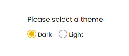
Please select a theme
Code Explanation
- Props: The component takes in props like
name,id,value,onChange,checked, andtextto control its behavior and display. - Input Styling: The radio button is visually hidden (
sr-only), while a styledspanshows the selected state. - Checked State: The inner
spanchanges color when selected, making it clear to the user which option is active.
How Demo Works
- State Management:
useStatemanages which theme option is selected. TheonChangeThemefunction updates the state when a user clicks on a radio button. - Radio Button Interaction: Each
RadioButtonpassesname,id,value,text, andonChangeprops, whilecheckedcontrols the active selection.
Read More!
Check out the tutorial to learn how to build a custom radio button component in React step by step.
Feel free to expand on this code by adding more options or customizing the style to better suit your project’s needs.