Elegant React Tailwind CSS Footer Components [2 Versatile Variants]

You rarely find a website without a footer, and for good reason—it’s a vital part of any website's design.

In this guide, I’ll walk you through implementing two sleek, fully responsive Tailwind CSS footer components, perfect for any project. With just a simple copy-paste, you can add these components to your site and customize them to match your brand's identity.

I have tried to cover all essential footer elements in this component. If something is left out, I will try to cover it in the next update with other variations.


Key Features of Our Tailwind Footer Components

Our carefully crafted Tailwind CSS footer components come with these 7 essential elements:

  1. Logo: Showcase your brand’s logo.
  2. Website Description: Briefly explain what your site is all about.
  3. Social Links: Direct users to your social media profiles.
  4. Contact Email: Provide a way for users to get in touch.
  5. Call to Action: Encourage users to take a specific action.
  6. Copyright Notice: Protect your content and display ownership.
  7. Scroll to Top Button: Allow users to easily navigate back to the top.

These Tailwind footer components can be used as a template too, and you can customize it however you like!

Note

The footer component's icons depend on the icon library luicide-react. You can download it using the command npm i lucide-react or use any icon library of your choice.

Simple Footer - Variant 1

Here's how the Simple Footer Component UI looks:

React Tailwind Css Simple Footer Template

To make the code modular and scalable, I've created a variable for social links. In case of any changes, we only need to update the variable.

Additionally, I've separated the description to make it easier to modify.

Tailwind CSS Simple Footer Code
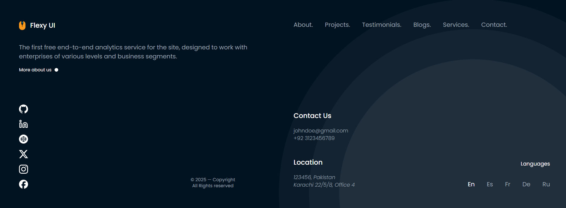
import { AtSignIcon, EarthIcon, FacebookIcon, HeadsetIcon, LinkedinIcon, TwitterIcon, } from 'lucide-react' const socialLinks = [ { name: 'LinkedIn', link: '/', icon: <LinkedinIcon />, }, { name: 'X', link: '/', icon: <TwitterIcon />, }, { name: 'Facebook', link: '/', icon: <FacebookIcon />, }, { name: 'Website', link: '/', icon: <EarthIcon />, }, ] const description = 'SkillSpot offers a range of free and paid online and offline courses in UAE, including topics like App Making, Data Skills, Photography, Money Management, and more. Improve your skills now!' const Footer = () => { return ( <footer className="relative z-50 bg-[#191F33]"> <div className="flex flex-col items-center px-4 py-12"> {/* app logo */} <div> <a href="/" className="mb-8 flex items-center justify-center gap-5 text-white" > <img src="https://res.cloudinary.com/dyvkdwzcj/image/upload/v1709055594/logo-1_vo1dni.png" className="h-8" alt="Logo" /> <span className="text-3xl font-semibold tracking-wider"> Flexy UI </span> </a> <p className="max-w-xl text-center text-lg font-medium text-white"> {description} </p> </div> {/* social links */} <div className="mt-8"> <span className="mb-6 block text-center text-lg font-medium text-[#767E94]"> Follow Us </span> <ul className="flex items-center gap-6"> {socialLinks.map(({ name, icon, link }) => ( <li key={name}> <a href={link} title={name} className="text-white hover:text-[#767e94]" target="_blank" > {icon} </a> <span className="sr-only">{name} account</span> </li> ))} </ul> </div> {/* email */} <div className="mb-2 mt-6 flex items-center gap-2 text-white"> <AtSignIcon size={16} /> <span className="text-lg font-medium">info@email.com</span> </div> {/* call to action */} <div className="mt-8"> <button type="button" className="flex items-center gap-2 rounded-lg bg-gray-800 px-5 py-2.5 text-base font-semibold text-sky-100 transition duration-300 ease-in-out hover:bg-gray-100 hover:text-sky-600" > <HeadsetIcon size={20} /> <span>Book A Demo</span> </button> </div> </div> {/* about author or app/copyrights */} <div className="bg-[#2E3447]"> <div className="px-3 py-3 text-center"> <span className="text-[#767E94]"> Coded with 💙 by{' '} <a href="https://www.linkedin.com/in/abdulbasitprofile/" target="_blank" className="text-white" > Abdul Basit{' '} </a> in Karachi </span> </div> </div> </footer> ) } export default Footer

Multi Column Footer - Variant 2

The multi-column footer is a popular choice for eCommerce sites and blogs, cover all the essential footer elements.

Multi Column Footer Component UI:

React Tailwind Css Multi Column Template

Tailwind CSS Multi Column Footer Code

import { EarthIcon, FacebookIcon, LinkedinIcon, TwitterIcon, } from 'lucide-react' const socialLinks = [ { name: 'LinkedIn', link: '/', icon: <LinkedinIcon className="size-6" />, }, { name: 'X', link: '/', icon: <TwitterIcon className="size-6" />, }, { name: 'Facebook', link: '/', icon: <FacebookIcon className="size-6" />, }, { name: 'Website', link: '/', icon: <EarthIcon className="size-6" />, }, ] const support = { title: 'Support', items: [ { label: 'Contact', href: '' }, { label: 'FAQs', href: '' }, { label: 'Pricing Plans', href: '' }, { label: 'Sitemap', href: '' }, ], } const quickLinks = { title: 'Quick Links', items: [ { label: 'Jobs', href: '' }, { label: 'Courses', href: '' }, { label: 'Paid Training', href: '' }, { label: 'Blog', href: '' }, ], } const category = { title: 'Category', items: [ { label: 'Graphics', href: '' }, { label: 'Programming', href: '' }, { label: 'eCommerce', href: '' }, { label: 'Freelancing', href: '' }, ], } const contact = { address: '4517 Washington Ave. Manchester, Kentucky 39495', phone: 'Phone: (405) 555-0128', email: 'info@learningonline.com', } const Footer = () => { return ( <footer className="bg-[#191F33]"> <div className="mx-auto max-w-7xl px-4"> <div className="grid gap-6 py-16 sm:grid-cols-[40fr_30fr_30fr] md:grid-cols-[40fr_30fr_30fr_30fr]"> <div className=""> <a href="/" className="mb-8 flex items-center gap-5 text-white"> <img src="https://res.cloudinary.com/dyvkdwzcj/image/upload/v1709055594/logo-1_vo1dni.png" className="h-8" alt="Logo" /> <h6 className="text-3xl font-semibold tracking-wider"> Flexy UI </h6> </a> <address className="mt-3 text-base font-normal text-[#767E94]"> <p className="mt-3 max-w-64">{contact.address}</p> <p className="mt-3">{contact.phone}</p> <p className="mt-3">Mail: {contact.email}</p> </address> </div> <div> <h6 className="mb-7 text-xl text-white">{support.title}</h6> <ul> {support.items.map(({ label, href }) => ( <li key={label} className="mt-3 text-base font-normal text-[#767E94] hover:text-white" > <a href={href}>{label}</a> </li> ))} </ul> </div> <div> <h6 className="mb-7 text-xl text-white">{quickLinks.title}</h6> <ul> {quickLinks.items.map(({ label, href }) => ( <li key={label} className="mt-3 text-base font-normal text-[#767E94] hover:text-white" > <a href={href}>{label}</a> </li> ))} </ul> </div> <div> <h6 className="mb-7 text-xl text-white">{category.title}</h6> <ul> {category.items.map(({ label, href }) => ( <li key={label} className="mt-3 text-base font-normal text-[#767E94] hover:text-white" > <a href={href}>{label}</a> </li> ))} </ul> </div> </div> </div> <div className="bg-[#2E3447]"> <div className="mx-auto flex max-w-7xl flex-col items-center gap-3 px-4 py-5 md:flex-row md:justify-between"> <p className="text-center text-[#767E94]"> Learning Online © 2023. Developed by{' '} <span className="text-white">Abdul Basit</span> </p> <ul className="flex items-center gap-6"> {socialLinks.map(({ name, icon, link }) => ( <li key={name}> <a href={link} title={name} className="text-[#767E94] hover:text-white" target="_blank" rel="noopener noreferrer" > {icon} </a> <span className="sr-only">{name} account</span> </li> ))} </ul> </div> </div> </footer> ) } export default Footer

Feel free to adjust the style and use the code in your app.

If this code helps you in your project, or if you need more components, please let me know via LinkedIn.


Flexy UI Newsletter

Build better and faster UIs.Get the latest components and hooks directly in your inbox. No spam!