

React Tailwind CSS Vertical and Horizontal Stepper Component
This guide will show you how to build a modular and functional Vertical Stepper component in React using TypeScript and Tailwind CSS. A stepper is needed for Multi-Step Processes, for example in ecommerce checkout or in any kind of form completion.
Its better to use pre build functional stepper component with React and Tailwind, and save development time.
This guide covers both Vertical and Horizontal stepper components, designed with React and Tailwind CSS. With Tailwind’s utility-first approach, you can quickly style components without switching between files.
Follow along to integrate these ready-to-use steppers into your project.
Vertical Stepper Component
Here, we’ll implement each step in its own reusable Step component, and we’ll use a custom SVG icon to indicate completed steps. This modular structure helps you easily integrate and customize the component in your project.
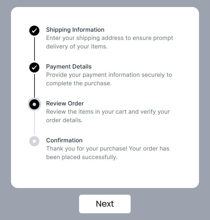
Vertical Stepper Preview
Here’s how the Vertical Stepper component appears:
Code for Vertical Stepper Component
This stepper component is designed to be both reusable and dynamic. The main component (Stepper) renders each step and handles state, while the individual Step component controls the styling and behavior of each step.
Stepper Component
The Stepper component manages the steps' data and transitions between each step. By updating the step data, we can control which step is active and which steps are completed.
Shipping Information
Enter your shipping address to ensure prompt delivery of your items.
Payment Details
Provide your payment information securely to complete the purchase.
Review Order
Review the items in your cart and verify your order details.
Confirmation
Thank you for your purchase! Your order has been placed successfully.
Checkout this step by step tutorial if you're building a multi-step form with a progress stepper.
Vertical stepper component performs the following tasks:
- State Management: Uses a
useStatehook to manage the current step data, determining which step is active or completed. - Next Step Functionality: The
handleNextStepfunction updates the active step when the "Next" button is clicked. - Button Control: The button disables when the last step is completed.
Step Component
Each Step represents an individual step in the vertical stepper. It has a title, description, and a check mark for completed steps as seen in data.ts file.
Key parts of the Step component include:
- Dynamic Styles: Uses Tailwind CSS classes to update styles dynamically based on the step's state (
activeorcompleted). - Custom SVG Check Mark: Displays a custom SVG for completed steps, making it visually distinct.
- Conditional Line Display: Shows or hides the vertical line between steps based on the
isLastprop, making the component modular.
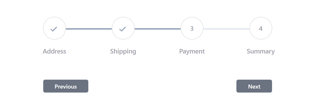
Horizontal Stepper Component
Horizontal Stepper Preview
Tailwind CSS Horizontal Stepper Component Code
Data Structure for Horizontal Stepper Component
To use this stepper component, you need to pass data to it as props. It's helpful to keep this data separate, maybe in its own file, to keep the code organized.
I have created a multi-step form with a horizontal stepper. It may help in speed up your development.
These pre-built, fully responsive Vertical and Horizontal Stepper components in React and Tailwind CSS can simplify your project’s UI. By directly copying the provided code, you can implement efficient multi-step navigation in your app.
For feedback or suggestions, feel free to reach out. If this guide was helpful, share it with other developers!