


Reusable React Tailwind Section Heading Components
No matter what app we are working on, we need section headings, since all apps have sections.
If we talk about blogs, e-commerce sites, landing pages, dashboards, agency pages, all kinds of apps consist of sections, and not all but some sections need section headings.
In section headings, we have a title (section title) and a subtitle (a little bit of description of the title). The subtitle is optional.
I'm sharing four versions of section headings and will update this page from time to time by adding new variants.
Why use these section heading components?
- Easy to integrate into any React project
- Built with Tailwind CSS for quick customization
- TypeScript support for better type safety and code predictability
Where to Use These Section Heading Components
Section headings are essential for structuring content in various types of applications. You can use these components in:
- Blogs – Clearly define categories like "Latest Articles" or "Popular Posts."
- E-commerce Sites – Highlight product categories, featured collections, or offers.
- Landing Pages – Improve readability with well-defined sections like "Features" or "Testimonials."
- Dashboards – Organize analytics, reports, and user activities.
- Agency Pages – Present services, case studies, or team introductions effectively.
These reusable section heading components help maintain consistency and improve the visual hierarchy of any React or Next.js based project.
Minimal Colors Heading
Since the section heading component is built using TypeScript, the interface needs two props: title and subtitle, and both are strings.
Result UI
This is how our minimal colors section heading UI will look.

Tailwind CSS Section Heading Version 1 Code
Latest Articles
Diverse Range of articles related to HTML, CSS, and JavaScript
Colored Heading
This version also needs two props, but title is an array of strings. We pass the title like this: ['Latest', 'Articles']. According to our logic, the second element of the title (index 1) will be colored.
If you have a longer title with more than two words, you need to adjust the title to fit your aesthetic.
Result UI
Result of colored Heading UI.

Tailwind CSS Section Heading Version 2 Code
Latest Articles
Diverse Range of articles related to html css and javascript
Detailed Center Heading
The interface needs three props: title, subtitle and shortDescription, and all of them are strings. You can adjust it as per your need.
Result UI
This is how our Detailed Center Heading UI will look.

Tailwind CSS Detailed Center Heading Code
Featured Categories
Shop by Category
Explore our curated collection of top products and discover the perfect items for your needs
Wide Section Heading with Light Text
This section heading component offers a wide layout with a light and airy feel.
If you want your title to be focused prefer this section heading component UI, it's perfect for spacious sections.
The interface needs two props: title (required) and subtitle (optional).
Result UI
This is how our Wide Section Heading with Light Text UI will look.
Tailwind CSS Wide Section Heading with Light Text Code
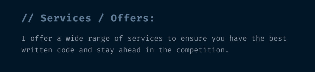
// Services / Offers:
I offer a wide range of services to ensure you have the best written code and stay ahead in the competition.
If you found this resource helpful, don’t forget to share it with your network and explore more React components in our library. You can also share your opinion on LinkedIn.