


6 Hero Section Designs with React & Tailwind
In this article, you'll find the code for five versions of a hero section that you can use on your landing pages, directory, ecommerce, or blog website. It's built with React and Tailwind CSS, and includes both full-screen and compact hero sections.
Full Screen Hero Component
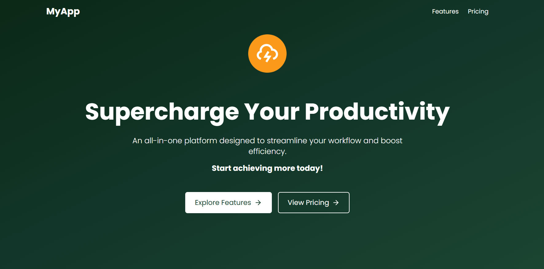
React Tailwind full screen hero components features:
- Responsive Navigation Bar – Includes a desktop menu and a mobile-friendly dropdown.
- Bold Headline & Subtext – Engaging typography to grab user attention.
- Call-to-Action Buttons – Styled for clear visibility and interaction.
- Fully Responsive Design – Optimized for both desktop and mobile screens.
This hero section is perfect for various types of web applications, including:
- SaaS Landing Pages – Ideal for showcasing software products with a clear call to action.
- Product Launch Websites – Engages visitors with a bold headline and CTA buttons.
- Startup & Tech Websites – Provides a modern and professional first impression.
- Marketing & Agency Websites – Helps convert leads with an appealing UI.
- Portfolio Websites – Great for personal branding with a strong visual presence
Tailwind Full Screen Hero Section Component Code
Supercharge Your Productivity
An all-in-one platform designed to streamline your workflow and boost efficiency.Start achieving more today!
Hero Component For Portfolio

Hi - I'm John DoeFULLSTACK DEVELOPER
Crafting innovative solutions to solve real-world problems

The Portfolio Hero component is dependent on two custom hooks.
- useRotatingAnimation
- useRoleSwitcher
useRotatingAnimation Hook
1interface RotatingAnimationOptions { 2 initialAngle?: number 3 rotationSpeed?: number 4} 5 6function useRotatingAnimation({ 7 initialAngle = 0, 8 rotationSpeed = 0.3, 9}: RotatingAnimationOptions = {}): React.RefObject<HTMLDivElement> { 10 const ellipseRef = useRef<HTMLDivElement | null>(null) 11 const ellipseAngle = useRef<number>(initialAngle) 12 const animationFrameId = useRef<number>() 13 14 useEffect(() => { 15 const rotateEllipse = () => { 16 if (ellipseRef.current) { 17 ellipseAngle.current += rotationSpeed 18 ellipseRef.current.style.transform = `rotate(${ellipseAngle.current}deg)` 19 } 20 animationFrameId.current = requestAnimationFrame(rotateEllipse) 21 } 22 23 animationFrameId.current = requestAnimationFrame(rotateEllipse) 24 25 return () => { 26 if (animationFrameId.current) cancelAnimationFrame(animationFrameId.current) 27 } 28 }, [rotationSpeed]) 29 30 return ellipseRef as React.RefObject<HTMLDivElement> 31} 32 33export default useRotatingAnimation
What it does?
- Creates a continuous rotating animation for SVG elements using requestAnimationFrame
useRoleSwitcher Hook
1interface RoleSwitcherOptions { 2 roles: string[] 3 interval?: number 4} 5 6function useRoleSwitcher({ 7 roles, 8 interval = 1800, 9}: RoleSwitcherOptions): string { 10 const [role, setRole] = useState<string>(roles.length > 0 ? roles[0] : '') 11 12 useEffect(() => { 13 const intervalId = setInterval(() => { 14 setRole((prev) => roles[(roles.indexOf(prev) + 1) % roles.length]) 15 }, interval) 16 17 return () => clearInterval(intervalId) 18 }, [roles, interval]) 19 20 return role 21} 22 23export default useRoleSwitcher
What it does?
- Cycles through an array of roles/texts at specified intervals
- Maintains current role state and automatically switches to next
Implementation
You can check out the portfolio hero section in action in the open-source GitHub repository Flexy Dev Next.js Portfolio Template.
Minimal Hero Section Light Mode
Hero Section Light Mode Component Code
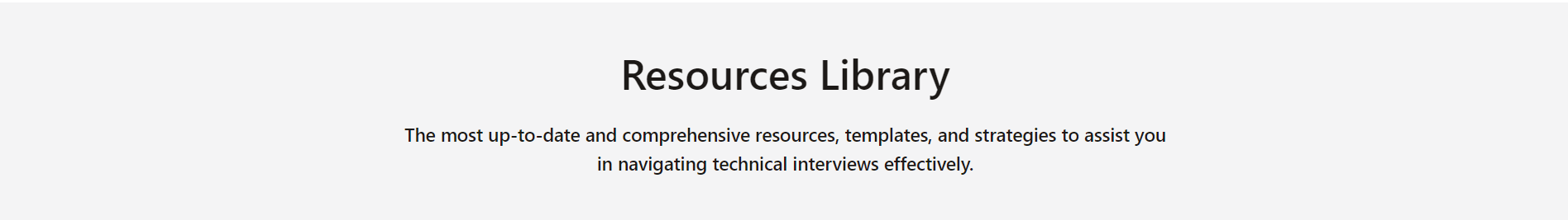
Resources Library
The most up to date comprehensive resources, templates, and strategies to assist you in navigating technical interviews effectively
Minimal Hero Component API
| Prop | Type | Required | Default | Description |
|---|---|---|---|---|
| title | string | Yes | undefined | Main heading displayed in the hero section. |
| description | string | No | undefined | Optional subheading displayed below the title. |
Both Light and Dark mode have same props.
Minimal Hero Section Dark Mode

Hero Section Dark Mode Component Code
Resources Library
The most up to date comprehensive resources, templates, and strategies to assist you in navigating technical interviews effectively
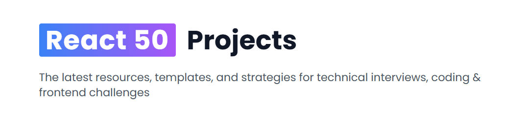
Gradient Hero Component
The screenshot of gradient hero component UI
React Tailwind Gradient Hero Component Code
React 50Projects
The latest resources, templates, and strategies for technical interviews, coding & frontend challenges
Gradient Hero Component API
| Prop | Type | Required | Default | Description |
|---|---|---|---|---|
| title | string[] | Yes | undefined | An array with two string values, where the first word is highlighted. |
| description | string | Yes | undefined | Text displayed below the title as a description. |
How to use in App.tsx
1function App() { 2 return ( 3 <div className="mx-auto my-12 max-w-7xl px-3"> 4 <Hero 5 title={['React 50', 'Projects']} 6 description="The latest resources, templates, and strategies for technical interviews, coding & frontend challenges" 7 /> 8 <div className="grid grid-cols-3 gap-7 px-4"> 9 {posts.map((post, idx) => ( 10 <BlogCard key={idx} post={post} /> 11 ))} 12 </div> 13 <Faq items={Faqs} /> 14 </div> 15 ) 16} 17 18export default App
Hero Section with Search Bar
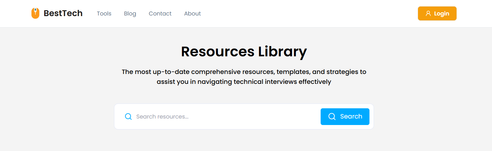
Resources Library
The most up-to-date comprehensive resources, templates, and strategies to assist you in navigating technical interviews effectively
The above hero section component depends on a reusable search bar component. Learn more about the search bar and its props.
Happy Coding!