

Create a Custom Circular Progress Bar with React and Tailwind CSS
Graphs and charts offer the most visually appealing and effective ways of presenting data, and the Circular Progress Bar is a modern and engaging way to represent progress.
In this document, you'll get a customizable Circular Progress Bar component made with React and Tailwind CSS, helping you enhance your UI with minimal effort.
Circular Progress Bar UI
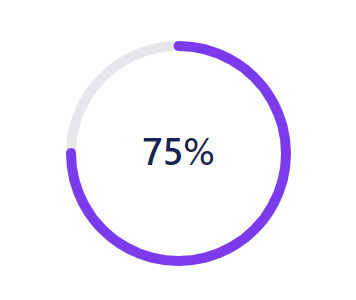
React and Tailwind CSS Circular Progress Bar Component
This Circular Progress Bar component is built with React and styled using Tailwind CSS. It allows for easy customization with three key props:
strokeWidth: thickness of the bar stroke.sqSize: specifies the diameter of the circle.percentage: the progress percentage, determine how much to fill.
Feel free to modify these props to fit your specific needs.
Component Code
How to Implement the Circular Progress Bar Component
To test the component, I've created an onChangeProgress method, which will update the progress to 20% on each click.
1import { useState } from 'react' 2import CircularProgressBar from './components/CircularProgressBar' 3 4function App() { 5 const [progress, setProgress] = useState(0) 6 7 const onChangeProgress = () => { 8 setProgress((prev) => prev + 20) 9 } 10 11 return ( 12 <div className="mx-20 my-20"> 13 <CircularProgressBar sqSize={180} strokeWidth={8} percentage={progress} /> 14 <button 15 onClick={onChangeProgress} 16 className="mt-4 min-w-[140px] rounded-lg border border-neutral-800 bg-transparent px-2 py-1 text-neutral-800 hover:border-gray-200 hover:bg-gray-200" 17 > 18 Update Progress 19 </button> 20 </div> 21 ) 22} 23 24export default App
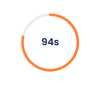
Circular Progress Bar with Timer
The TimerCircularProgressBar is a React functional component that visually represents a countdown timer using an SVG-based circular progress bar. It gradually decreases from 100% to 0% over a specified duration.
Props
strokeWidth(optional,number): Defines the thickness of the circular progress bar. Default is8.sqSize(optional,number): Specifies the width and height of the SVG container. Default is180.duration(optional,number): Total countdown duration in seconds. Default is120.
How It Works
- The component maintains a
percentagestate, starting at 100% and decreasing every second. - It calculates the stroke dash offset dynamically to animate the circular progress.
- The remaining time (in seconds) is displayed at the center of the circle.
Timer ProgressBar UI
Component Code
If you find this guide helpful, please let me know your thoughts. Your feedback encourages me to create more useful components for the community.